
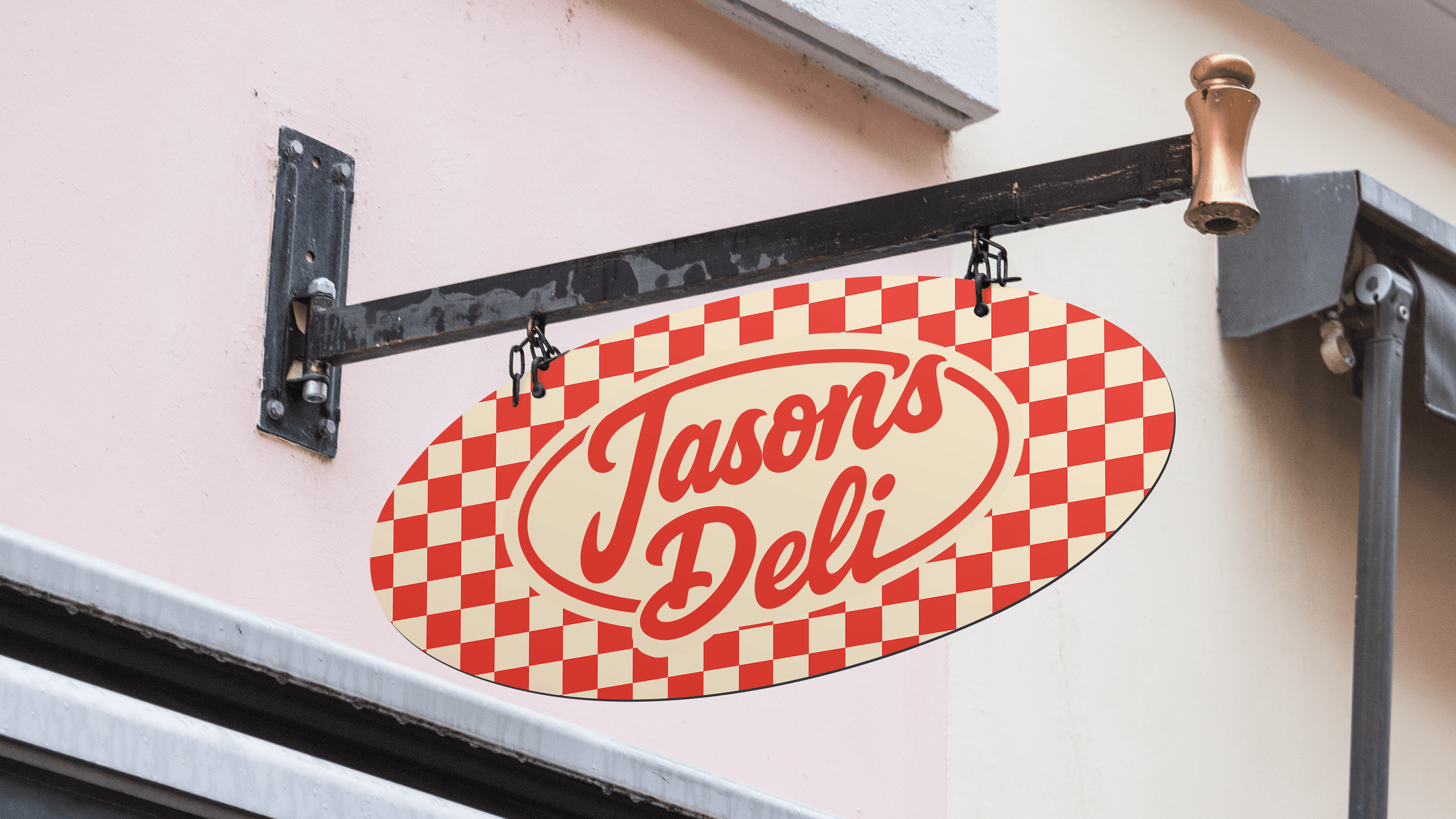
Jason’s Deli was reimagined with a more contemporary identity designed to connect with a younger audience while remaining familiar to longtime customers. The rebrand brings together a new logo system, color palette, typography, packaging, signage, and digital applications to create a more cohesive and recognizable brand.
Research
Noted outdated visuals and inconsistent brand tone across Jason’s Deli touchpoints. Customers perceived the brand as trustworthy but not modern. Analyzed competitors with stronger digital presence.
Define
The brand needed a refreshed identity that feels approachable and timeless. Aimed to attract younger audiences without alienating loyal customers. Key values: warmth, community, and simplicity.
Ideate
Refined color contrast and packaging patterns. Simplified shapes for easier printing. Introduced a secondary mark for digital applications.
Prototype
Designed a full rebrand kit—logo system, packaging, signage, and UI mockups. Created realistic product renders to visualize the identity in use. Balanced heritage with a minimalist update.
Test
Shared with peers and professors for critique. Feedback showed strong emotional connection to the new look. Adjusted letter spacing and weight for better scalability.
Iterate
Refined color contrast and packaging patterns. Simplified shapes for easier printing. Introduced a secondary mark for digital applications.
Launch
Presented as a brand guidelines deck with mockups. Designed marketing collateral and promotional visuals.
Evaluate
Successfully repositioned Jason’s Deli as a modern comfort brand. Viewers noted its balance between nostalgia and clarity. The redesign reflects design maturity and brand strategy skills.